My research skills
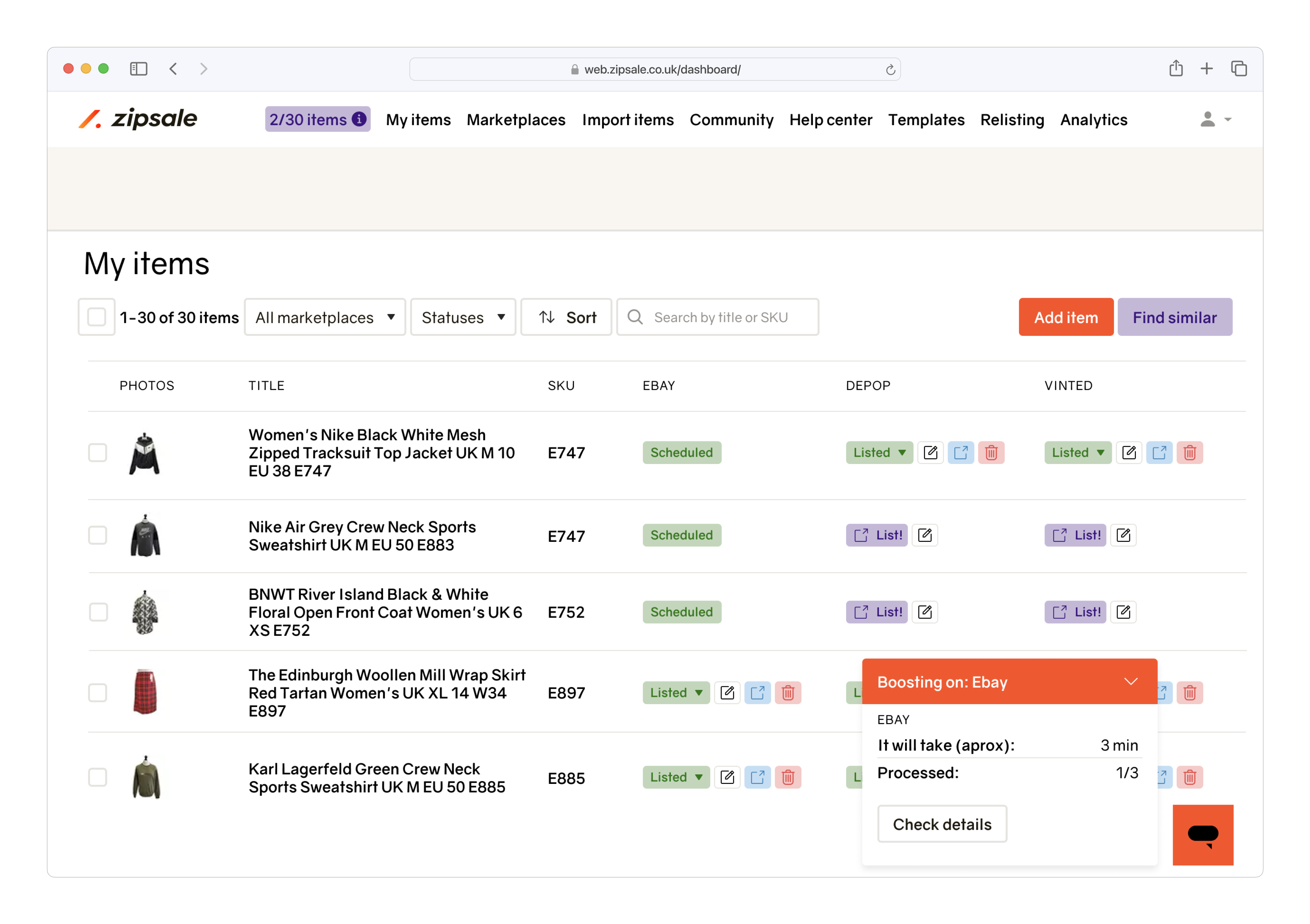
An example of user experience part of my work. I did quantitative research, interactive prototypes and launched a new feature within 2 months.
Time to read: 4 minutes
Table of contents
My role
Product designer
Year
2023
Timeline
2 months
Team
- 1 founder
- 2 full-stack engineers
- 1 customer support agent
Product
Zipsale – software for professional resellers in the UK.
Problem we solve:
- imagine having 100s items to sell e.g. vintage/preloved clothes, shoes or antiques. To sell your items faster, you want to be present on multiple marketplaces such as Ebay, Depop, Etsy, Vinted, or Shopify.
- managing items manually across all these platforms can be a daunting task and can limit your ability to scale your business. That's where our product comes in to automate the process of cross-listing and auto-delisting.
Numbers: launched 3 years ago, hundreds of paying customers, 2,500,000+ listings made.
Task
"High-level" task: increase retention
"Low-level" task: solve frequently reported problem
Problem: we don't support important workflow. There is a way to get more sales: delete and list again stagnant items. The items you sell must be fresh. I was assigned to research, design and launch the feature.
Metrics I (would) have tracked
Daily Active Users (DAU)
What: number of unique users who use the feature at least one time
Why: to understand if the number of active users is growing or falling
Monthly Recurring Revenue (MRR)
What: revenue from the feature split by the revenue from new, retained and resurrected users
Why: to understand if [1] we earn the money and [2] whether money comes from new or retained users
Funnel conversion rates
What: conversion rates between "feature description" -> "payment page" -> "purchase" steps. Plus time to convert, and frequency of each step.
Why: to identify areas for improvement
In addition to the above, I would have watched Hotjar sessions and tracked the total number of items relisted per day to track if users actually use the feature. It wasn't done due to the lack of time and resources.
In reality, I relied on MRR only and manually checked new and churned subscribers. If users unsubscribed I reached out to them directly.
Research
Qualitative research
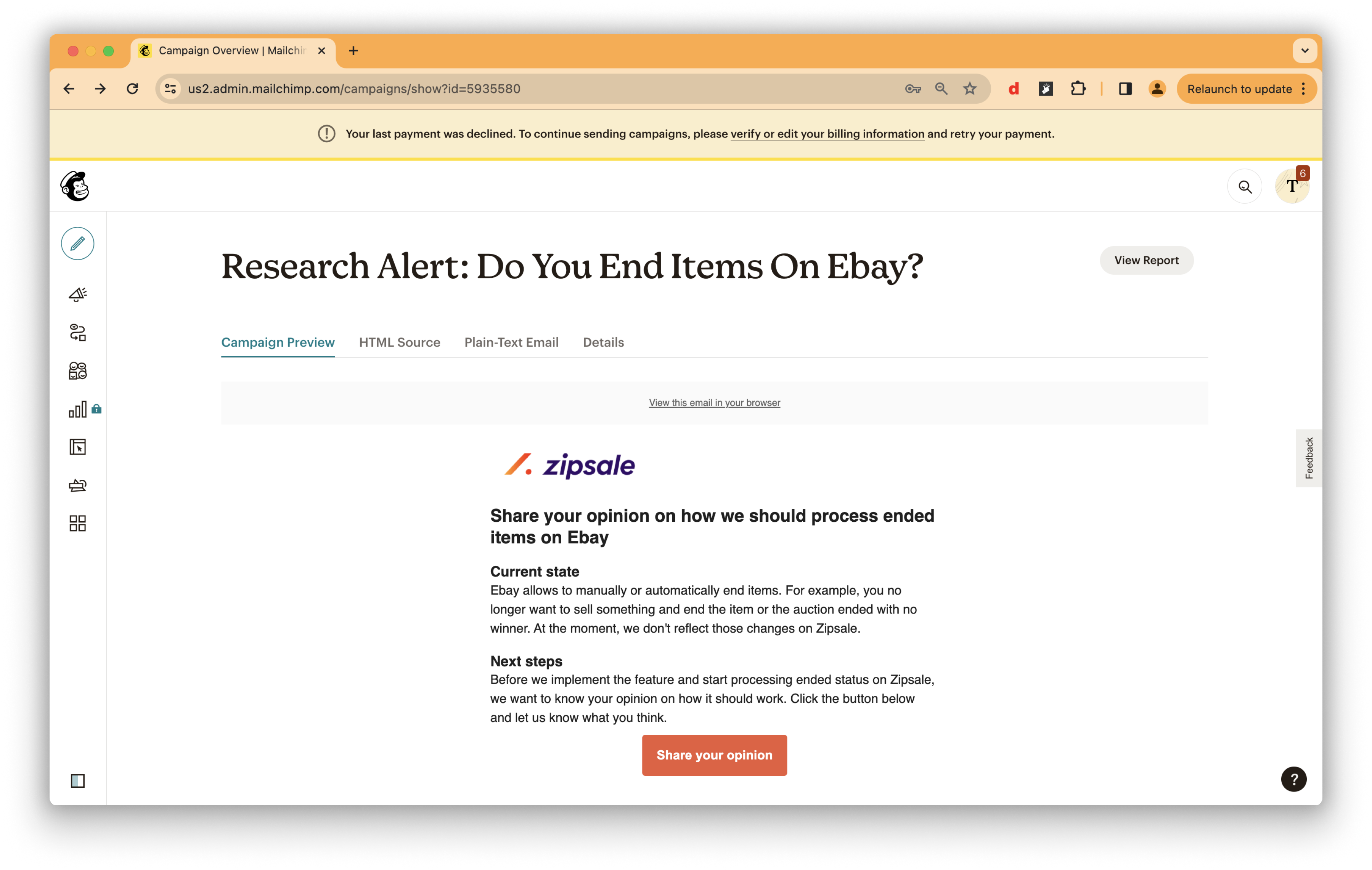
Launched an email campaign to confirm the problem {↓}
Received and processed 25 responses from users {↓}
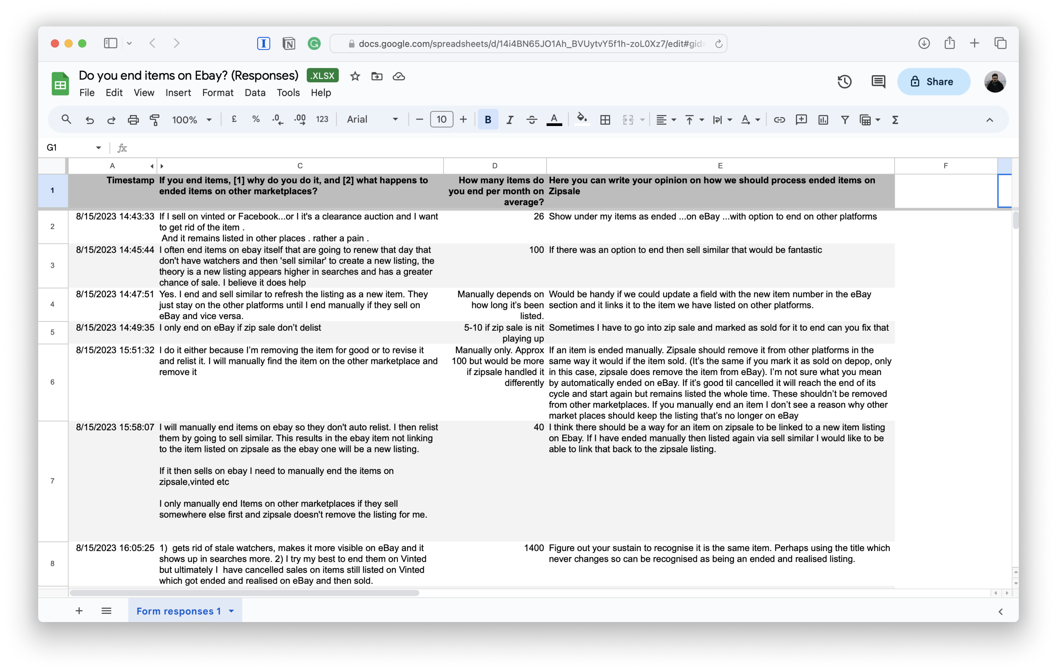
Conclusion
problem confirmed: resellers face the stated problem
new findings:
- discovered behaviour: users end items based on how old items are
- contradictive requirements: some users want to end items on one marketplace only, some want to do it on multiple platforms in one go
User interviews
- Created 3 interactive prototypes to test potential solutions.
- Conducted 5 user interviews to choose the best option.
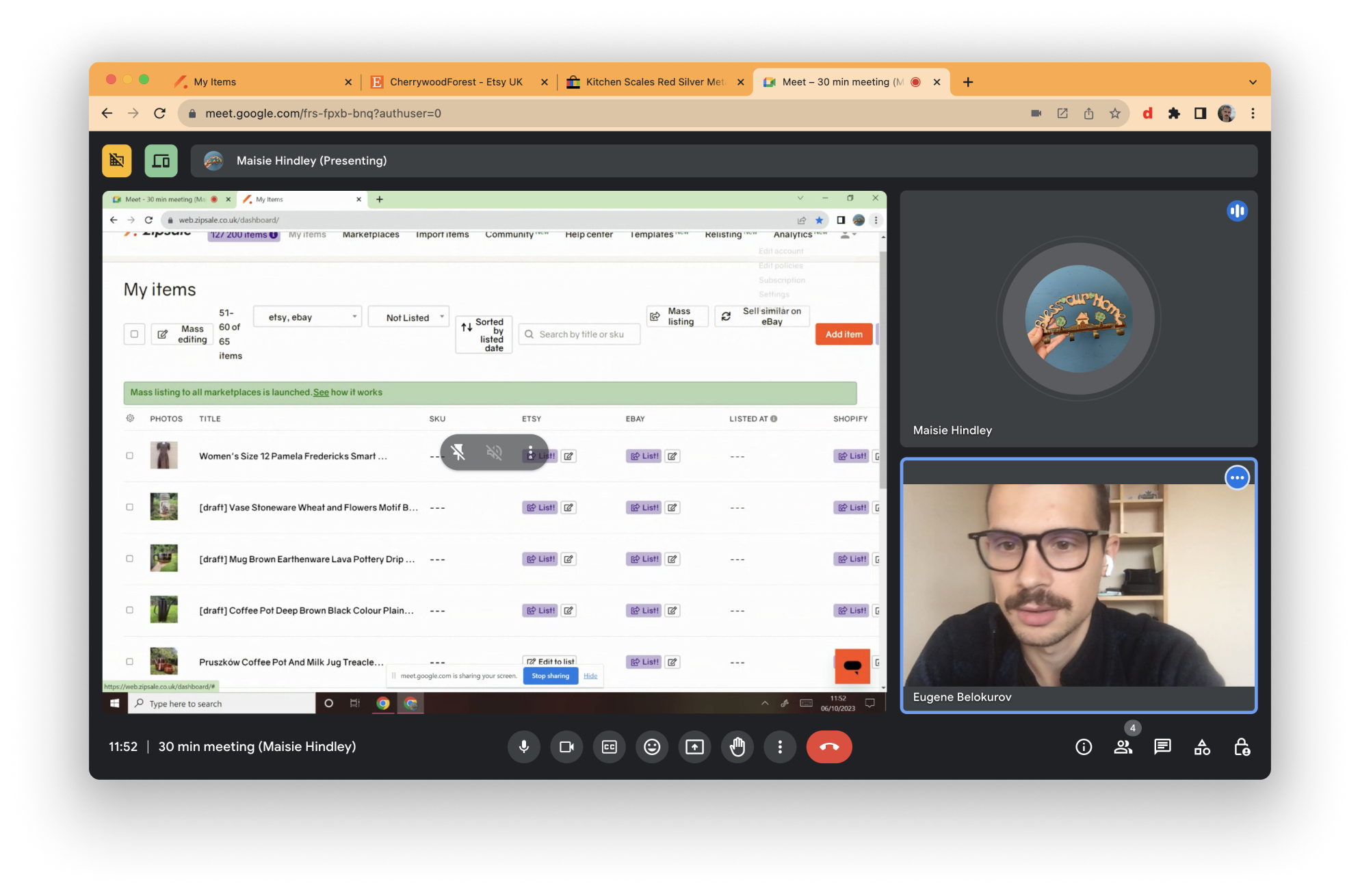
I find user interviews in pair with interactive prototypes a cheap and fast way to test if proposed solution will be understood by users.
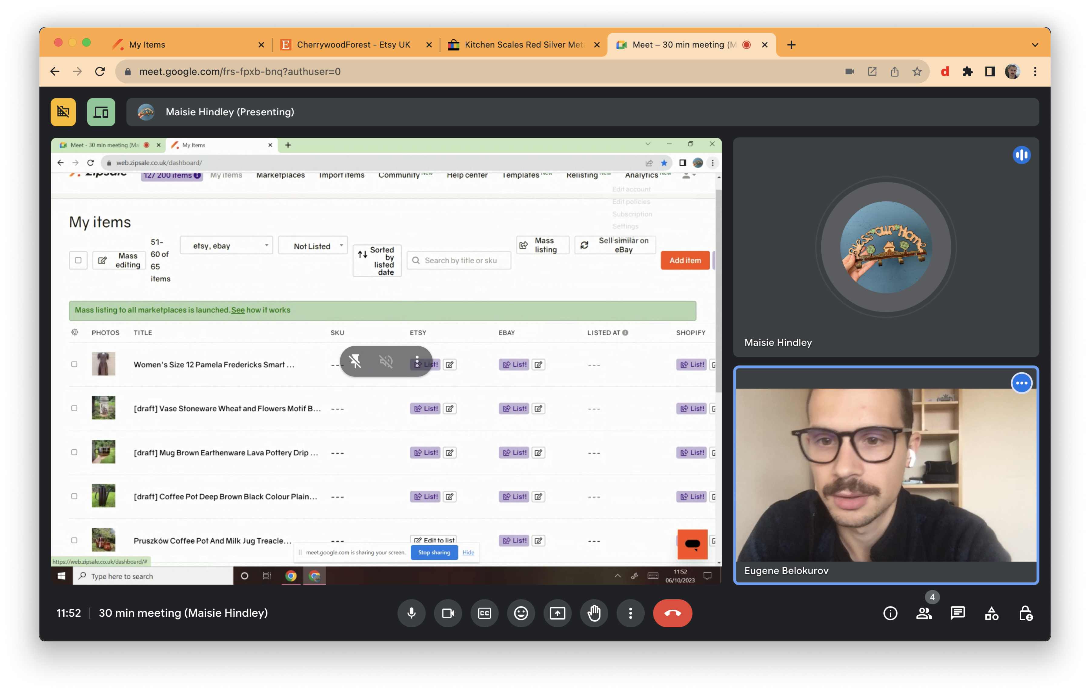
Users were given a task and I silently observed if they face any struggles {↓}
Prototypes that didn't make it
The option below appeared to require more than a month of engineering work. We couldn't afford it. {↓}
Option 1: new dashboard view
Most of the users were confused when interacting with this prototype. Plus it also was too complicated engineering-wise. {↓}
Option 2: boosting on multiple marketplaces
Conclusion
The simplest version won: the one with less clicks and allowing to work with one marketplace at a time. You will find it below.
Discussing outcomes with the team
- Engineering team lead: we had a tight timeline and limited resources. I wanted to make sure that the solutions I came up with are feasible.
- Founder: I aligned with the founder to make sure the solution is compliant with company’s strategy.
Final changes and handoff to engineers
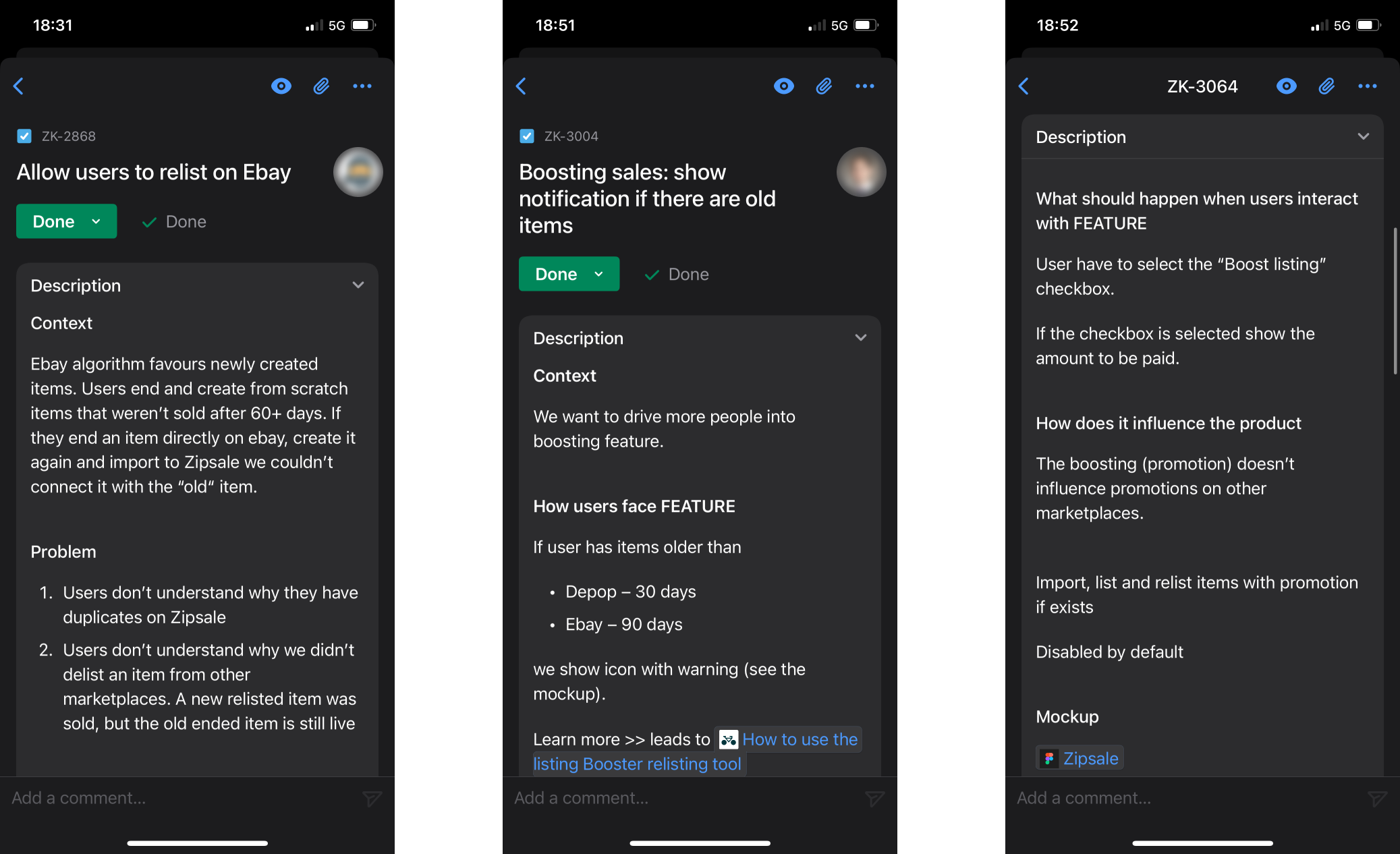
I refined the final version based on feedback from users and the team. Then prepared the task description for engineers.
I usually use the following structure when describing taks: [1] Context; [2] How users face FEATURE; [3] What should happen when users interact with FEATURE; [4] How does it influence the product; [5] Link to interactive prototype in Figma.
It allows to explain engineers why we are working on a feature and how it impacts the whole product.
Final design
Running extra mile
To drive users into the new feature I came up with an idea of a new type of notification. If a user has any items older than 90 days, a yellow clock icon will automatically pop up. When clicking on a notification, a tooltip with an explanation and link to the FAQ will appear.
Key takeaways
Results
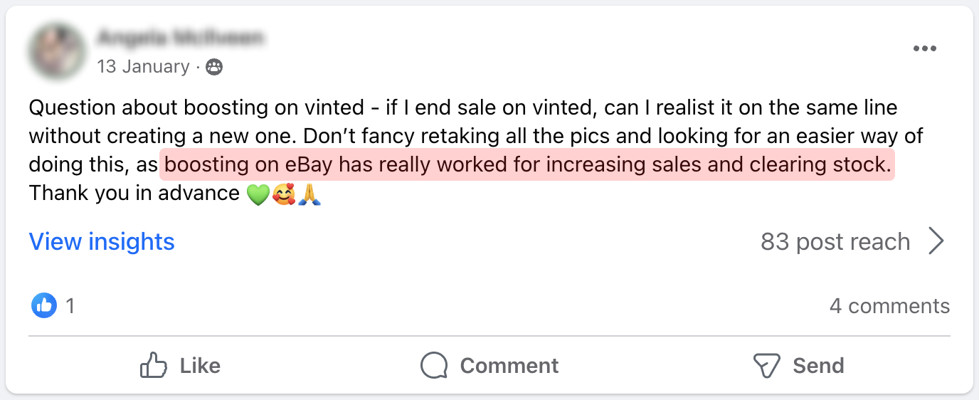
- Customers found new feature very useful.
Lessons learned
- Start recruiting users for interviews as soon as possible. It took me 2 weeks to complete the interviews because of users' tight schedules. Next time I will start scheduling interviews the same moment I start working on prototypes. It works especially for B2B products and/or if you have a small user base.
- Manage users' expectations from the beginning. The first interview went a bit off track because the user expected my prototype to be fully functional and they focused on the wrong thing. To avoid this, it's essential to communicate the task and constraints from the start. For the rest of the interviews, I followed this approach, and everything went smoothly.
Next steps
- Create more touchpoints communicating users about the feature
- Add support of more marketplaces
- Speed up the performance