How I designed mobile app from scratch
The app solves the problem of expanding vocabulary for advanced English speakers. I had a chance to get my hands on working with APIs, native mobile products and interface guidelines.
Problem
it is hard to expand vocabulary for advanced english-speakers
Imagine being new to the english-speaking environment. You would want to express your thoughts with ease hence you are in need of extensive vocabulary. To store and practice regularly you need a tool. My market research showed that there is no one-stop solution.
Solution
mobile app to collect and practice your vocabulary
Imagine being new to the english-speaking environment. You would want to express your thoughts with ease hence you are in need of extensive vocabulary. To store and practice regularly you need a tool. My market research showed that there is no one-stop solution.
The apps revolves around three main Job Stories: [1] saving new words; [2] learning using spaced repetition methods and flash cards; [3] navigating your dictionary.
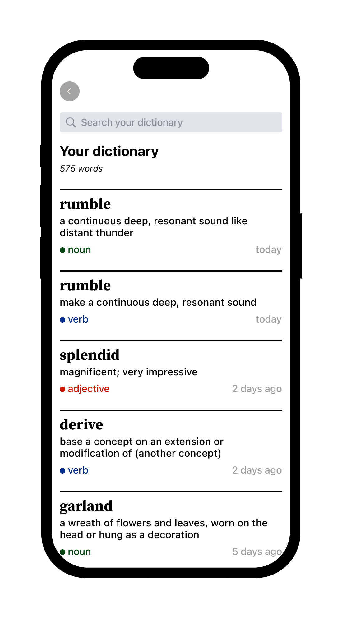
saving new words
working with dictionary
searching for saved words
memorizing saved words
Metrics I would track
Since the app isn't live yet I can only theorise here.
In addition to the below, I would watch Hotjar sessions and track the total number of words saved and practised per user per day to understand if people actually use the product.
Daily Active Users (DAU) + WAU + MAU
What: number of unique users who use the feature at least one time a day
Why: to understand if the number of active users is growing or falling
Monthly Recurring Revenue (MRR)
What: revenue from the subscriptions split by the revenue from new, retained and resurrected users
Why: to understand if [1] the app earns the money and [2] whether money comes from new or retained users
Funnel conversion rates
What: conversion rates between “acquisition”, “activation”, “retention”, and “revenue” steps. Plus time to convert, and frequency of each step.
Why: to identify areas for improvement
Lessons learned
- Interactive prototypes are hard. Gained a deep dive into prototyping entire workflows and utilising interactive components in Figma. Also got a chance to learn other tools e.g. Protopie.
- MD and HIG are a good starting point. I relied on both Material Design by Google and Human Interface Guidelines by Apple in choosing the layout grid, margins, paddings, touch areas etc. By doing so, I was able to ensure that my designs were in line with industry standards.
- Design systems speed up development. I studied design systems made by Uber, Atlassian and OpenAI. They guided me in creating individual elements and components for my app.
- Colour palette, typography, grid systems. I relied on "Grid Systems in Graphic Design" by Josef Müller-Brockmann, "The New Typography" by Ian Tschichold and YouTube videos by some brilliant people. These topics are of an infinite depth. But at least I started.
Read full case